布尼的冒險日誌(Spoony's Adventure)
You can travel the world before you even leave home — a travel journal site built around a companion-style reading experience, using a character-led narrative to turn itineraries, food, and stays into a journey that doesn’t get you lost.
About the Project
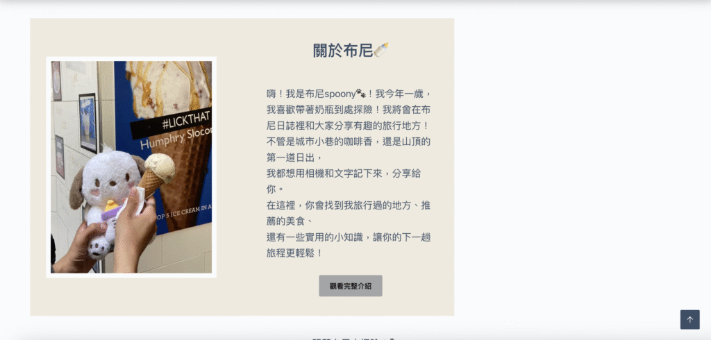
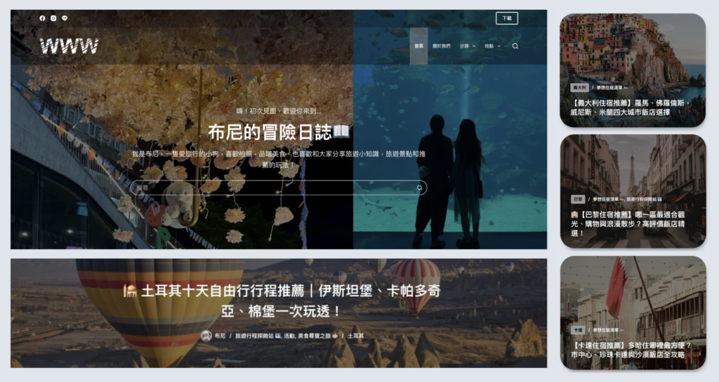
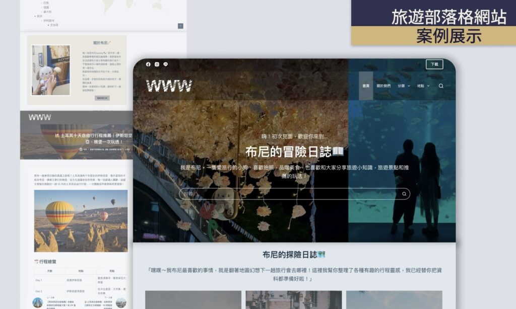
This is a travel journal site built around a companion-style reading experience. Even if a visitor has no travel plans yet, story, photography, and interaction design let them feel the adventure, novelty, and scenery of the road — as if following the main character along the way. A personified lead character guides the narrative, keeping the tone approachable and lowering the barrier to reading.
The Situation
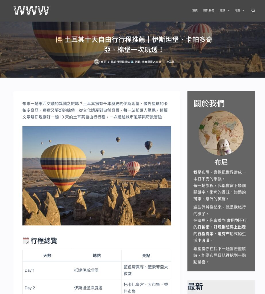
Most travel blogs lean on dense text, making the homepage heavy to read. Photography — the fastest way to build atmosphere — often lacks structure or narrative, turning into browsing rather than experience. And itineraries, food, and stays presented without a clear lead-in easily leave readers lost, even when the content itself is great. The key insight: a travel site isn’t just a collection of information — it’s a guide for an experience.
Story-Flow UX & Information Architecture
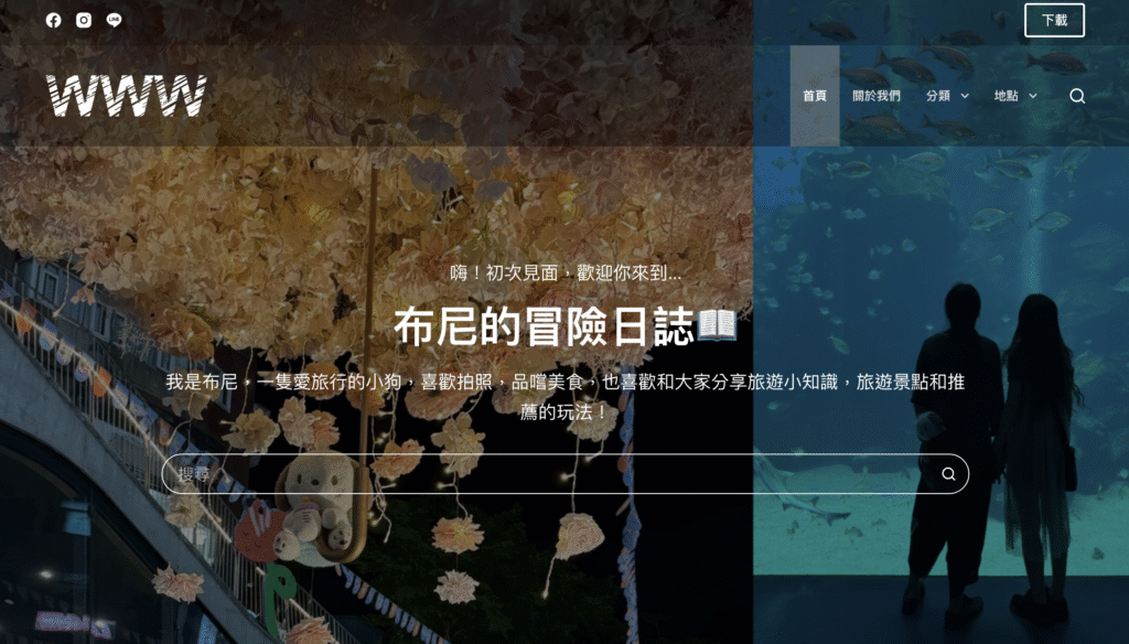
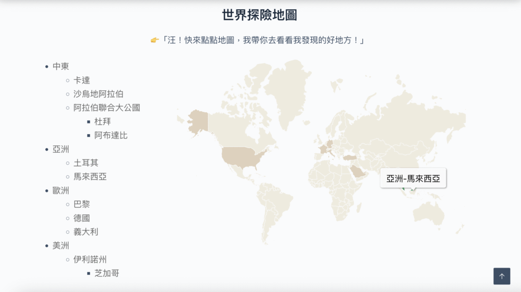
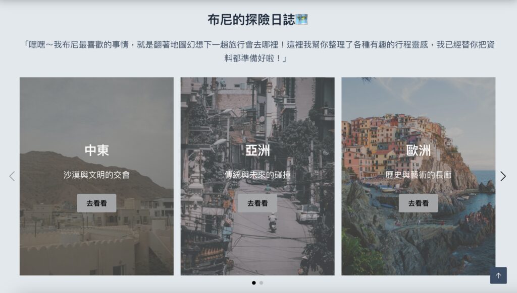
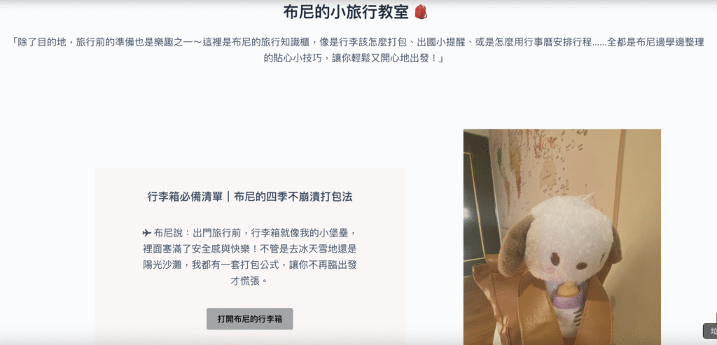
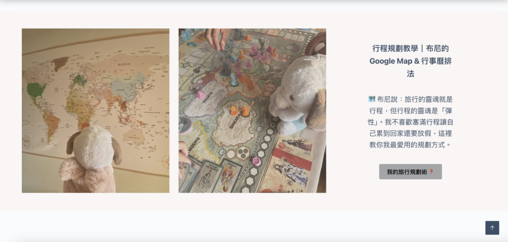
Instead of stacking individual posts, the site follows a story-flow order: lead-in story → character introduction → featured opening photos → a warm reminder → visual map navigation — naturally guiding readers to explore more pages. The homepage is clearly split into three categories (Itineraries / Food / Stays), and WordPress categories and tags form an extensible content structure, so future trips don’t require rebuilding the layout.
— Experience positioning: the site as a handy travel journal to dip into anytime, not a long read to finish in one sitting — paced around “taking your time to see the world.”
— Reading flow: ordered to match a visitor’s mindset after landing — lead-in story, character introduction, opening photos, a warm reminder, then map navigation.
— WordPress structure: modular blocks plus categories/tags for consistent updates and future scalability.
Visual & Reading Experience Integration
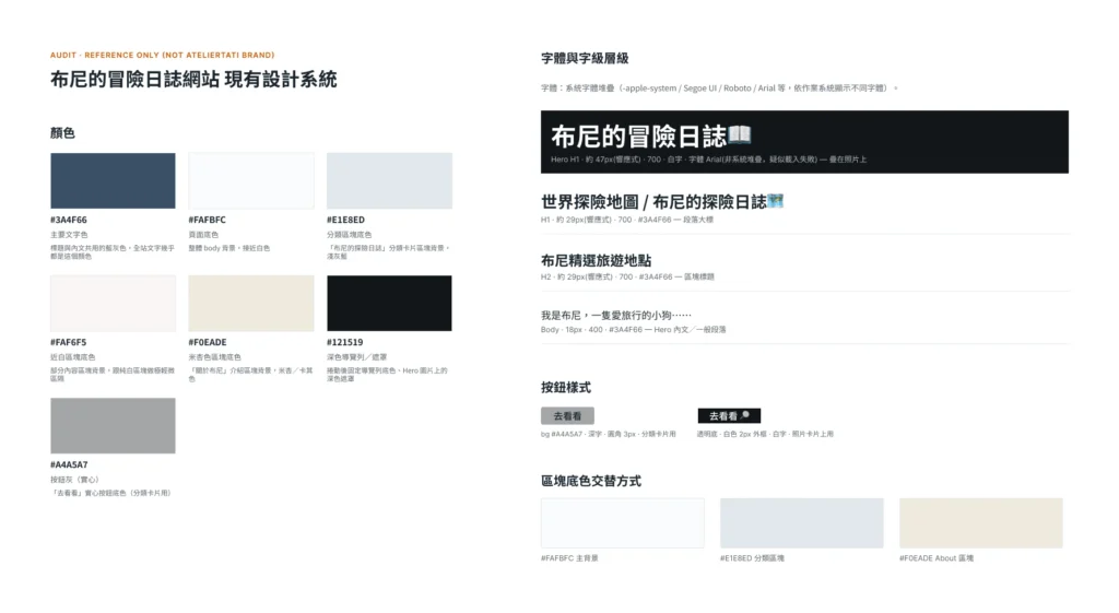
The site uses a borderless layout and vivid travel photography for a freer, more immersive feel. Typography, whitespace, and color were all chosen around “comfort” and “focus,” avoiding decorative clutter so the text and photos stay the natural center of attention — large-format photography carries the first impression, with text as a supplement rather than the lead.
Role & Contribution
— UX/UI design, WordPress site build.
— Planned the overall site experience and reading flow (Story Flow).
— Designed desktop/mobile interfaces and UI components.
— Planned visual interactions (map navigation, section guidance).
— Adjusted design details for RWD and real-world content updates.
Results & Feedback
— Built an experience-led travel journal site rather than a stack of information.
— Visitors are visually drawn in quickly and can choose their own path based on interest.
— The site successfully conveys “the world is big and worth looking forward to” — even without an immediate trip planned, readers can still feel the beauty and variety of travel.
— Validated that solid UX structure and visual guidance make content itself easier to understand and remember.
More Work
Three service types and projects.
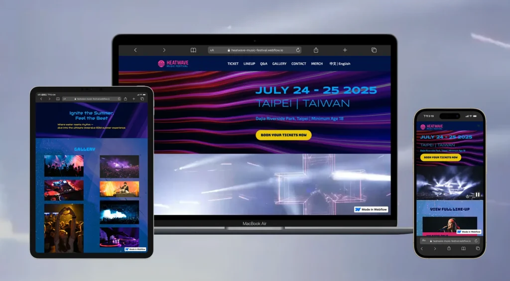
Translating event energy into a high-contrast, high-impact visual system.
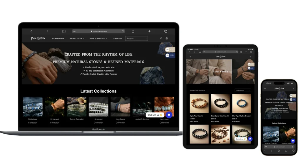
Reorganizing a cluttered product catalog into a clear, quietly luxurious storefront.
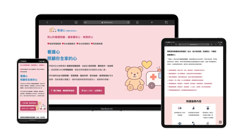
Turning scattered social posts into a high-trust official home for long-term care.
Build a Digital Presence Worthy of Your Work
If you also have a brand or a website that’s never quite been organized, let’s talk.