Creolio Translator

A strategic UI/UX transformation of a language learning and translation application, moving away from “gamified” children’s aesthetics toward a sophisticated interface for adult professionals and advanced learners.

About Creolio

Creolio is a “Translation-First” auxiliary learning tool. Unlike standard apps that rely on daily streaks and “childish” rewards, Creolio aims to be a utility-driven companion for adult learners who need a sophisticated, “pick-up-and-go” experience that fits into a busy professional life.

The Situation

Most language-learning apps lean into a cute, playful look — which becomes a burden for mature users. What the client needed was something easy to pick up and use anytime, not something that felt like a game. The challenge: the brand itself is built around a “Jungle Exploration” theme, so we had to keep that sense of adventure while still designing something clean, polished, and professional — without tipping into childish or overly serious.

Visual Hierarchy & Illustration System

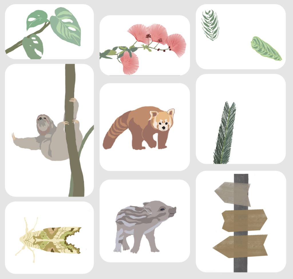
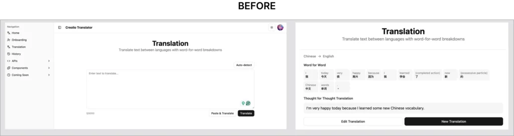
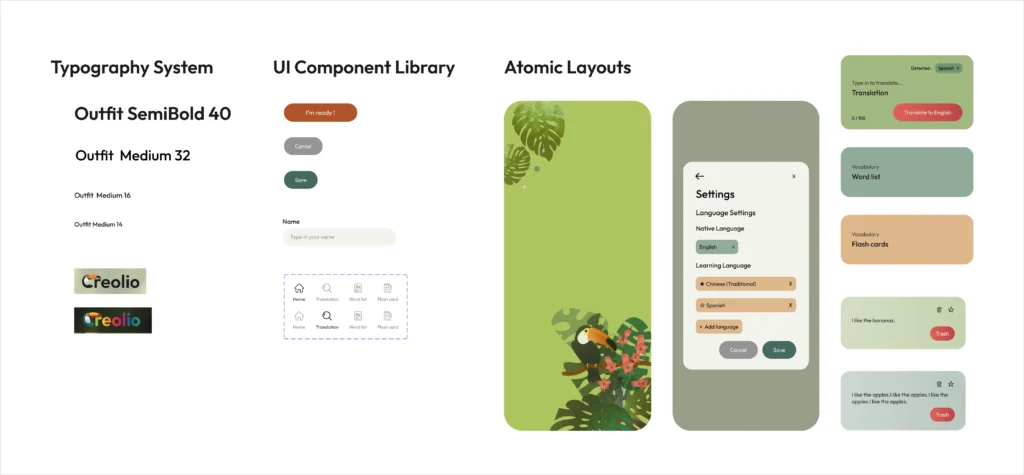
A gradual shift from a bare-bones logic sketch to a polished, professional interface. The process also produced a systematic Figma component library for easy scaling and maintenance, alongside a set of original illustrations created along the way.

Figma Component Library: A systematic design infrastructure built with auto-layout precision for seamless scaling and maintenance.

The Solution: Functional UX Architecture

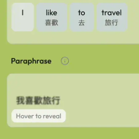
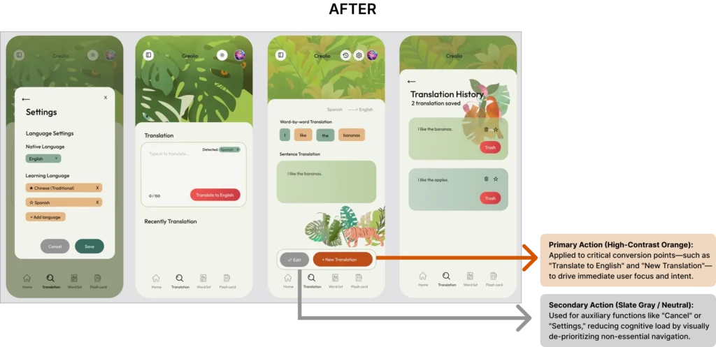
We performed a deep UX overhaul. Instead of rounded, “bubbly” buttons, we implemented controlled corner radii to maintain a professional edge. We also designed a “think-first” mechanic — translation results appear blurred at first, so users recall the answer from memory before revealing it, helping the learning stick. Every UI element was mapped to a functional purpose: high-contrast orange for primary actions, neutral grays for secondary data, keeping the screen free of distracting clutter.

Technical Specifications

— UX Architecture: Functional Logic Mapping & User-Flow Streamlining.

— Cognitive UI Design: High-Contrast Visual Hierarchy & Mature Color Systems.

— Design System Build: A Figma component library built for easy scaling and maintenance.

— Interaction Strategy: A “think-first” mechanic that helps memory stick.

Cognitive Reveal Protocol: A psychology-driven interaction designed to trigger active memory recall and deepen user engagement.

The Results

— Professional Alignment: Stripped away the clutter and decoration, so the whole interface reads like a tool built for focused adult learners — not a game for kids.

— Development Readiness: Delivered a structured Figma Component System, ensuring seamless handoff and RWD implementation.

— Positive Market Feedback: Visitors at the startup showcase responded positively, praising the interface as “warm and eye-catching” — capturing exactly the sense of adventure the brand wanted to convey, while still feeling warm and professional.
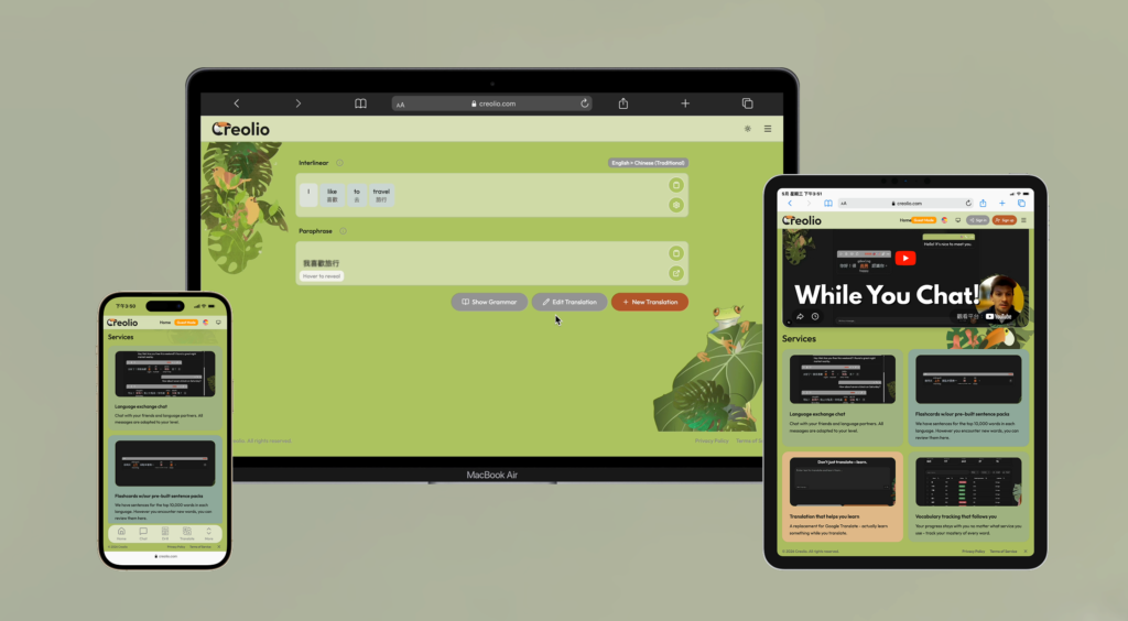
Visual Hierarchy Mapping: A strategic transition from low-fidelity logic to a high-cognition, professional-grade interface.
Strategic Color Theory: Mapping cognitive focus through a high-contrast, mature visual hierarchy.

At the Startup Showcase

Photos from Creolio’s startup showcase appearance.

“When Tatiana shared the initial UI framework, it aligned perfectly with what we envisioned. She balanced our exploration theme without making it feel childish. At our startup exhibition, visitors complimented how warm and inviting the whole design felt — it really captured that sense of adventure we were going for. Working with Tatiana felt like a true partnership—she listened deeply and delivered exactly what we needed.”

Jon Knebel
Founder, Creolio

More Work

Three service types and projects.

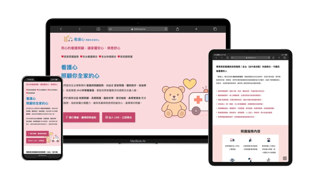
Turning scattered social posts into a high-trust official home for long-term care.

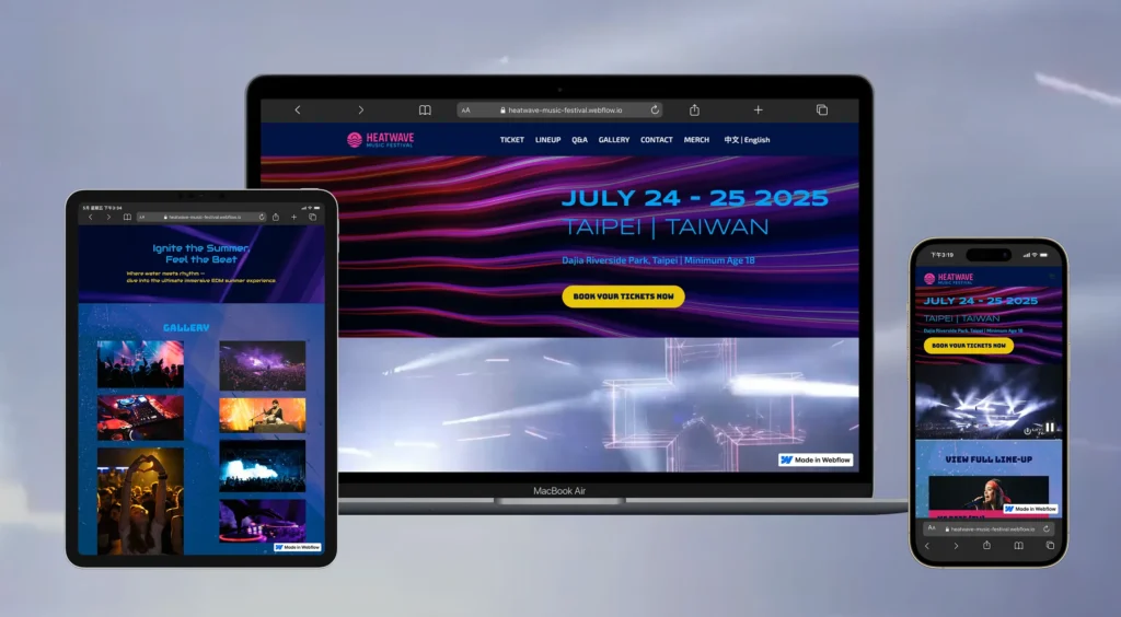
Translating event energy into a high-contrast, high-impact visual system.

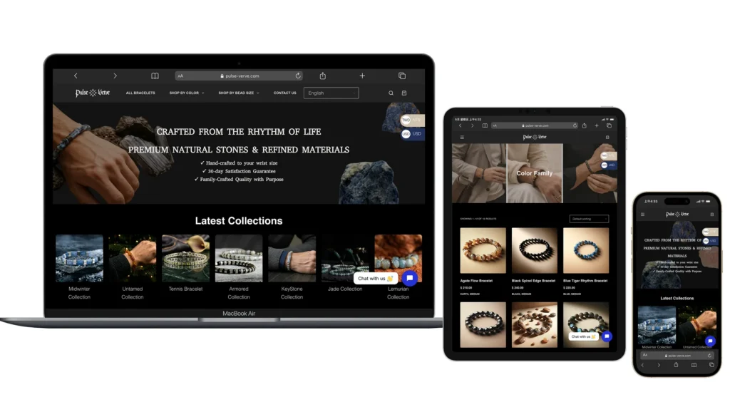
Reorganizing a cluttered product catalog into a clear, quietly luxurious storefront.

Build a Digital Presence Worthy of Your Work

If you also have a brand or a website that’s never quite been organized, let’s talk.