Duss' English

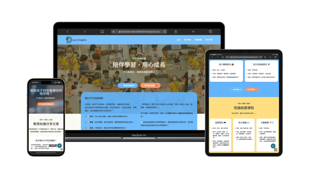
A visual and structural redesign for an early-childhood English education brand, with clear content navigation and a “soft yet professional” interface style that helps parents feel at ease right away.

About the Project

Duss’ English is an early-childhood education brand built around immersive English learning. The goal for this site was to create something that feels as warm as a real classroom, while still being professional and trustworthy enough for parents.

The Situation

Educational websites often lean too corporate and cold, or too cartoonish to feel professional. The challenge was finding the middle ground: playful enough for kids, but structured and serious enough for parents to trust. The existing content was scattered, making it hard for parents to quickly find age-appropriate classes.

High-Empathy Visual Identity

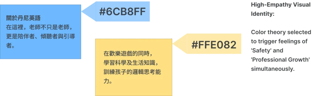
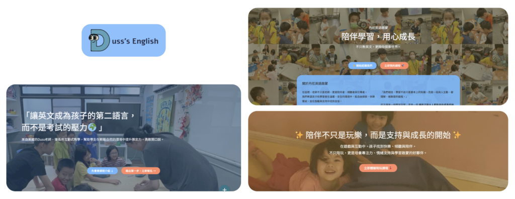
We designed a “soft-professional” color palette paired with creamy tones and real-life photography — replacing generic stock images — so parents feel a sense of safety and reliability the moment they land on the site.

High-Empathy Visual Identity: A strategic "Soft-Professional" palette engineered to establish a safe, reliable digital environment for discerning parents.

The Solution: Trust-Based UX Design

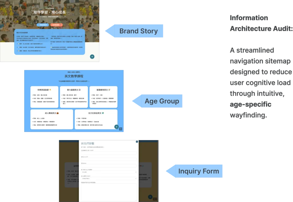
I designed a “story-first” user journey — the homepage explains the why before the what, instead of opening with a cold list of classes. To fix the navigation problem, I organized courses into clear, age-based modules so parents can find what they need in under 10 seconds. We also built out a helpful content section with practical parenting insights, to build long-term trust in the brand.

Technical Specifications

— Information Architecture Audit: A streamlined navigation sitemap designed to reduce cognitive load through intuitive, age-specific wayfinding.
— UX Architecture: Intuitive age-based course filtering.

— Content Strategy: Story-led homepage narrative.

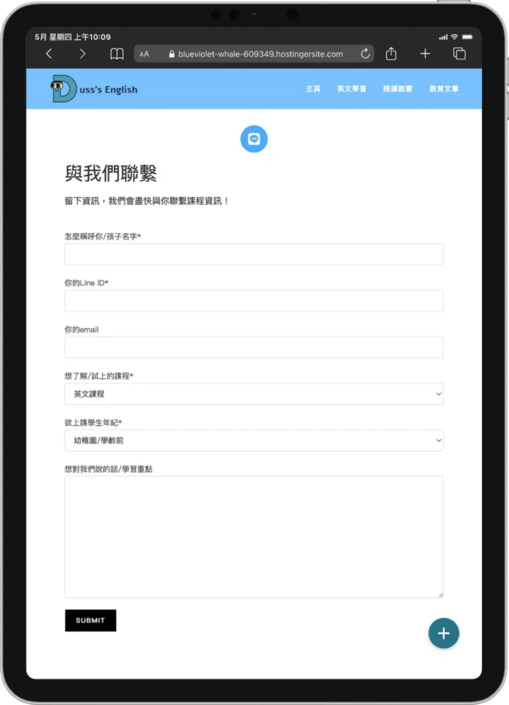
— Conversion Design: Modular inquiry form integration for streamlined lead acquisition.

Information Architecture Audit: A streamlined navigation sitemap designed to reduce user cognitive load through intuitive, age-specific wayfinding.
Services, Features & Business Results

Services Utilized Technical Features Business Results
UX Architecture Intuitive Age-Based Course Filtering Reduced Information Friction
UI Design “Soft-Professional” Palette & Spacing Established Institutional Trust
Content Strategy Story-Led Homepage Narrative Increased Brand Resonance
Conversion Design Modular Inquiry Form Integration Streamlined Lead Acquisition

The Results

— Brand Credibility: Transitioned to a high-fidelity design that positioned the brand as a premium educational choice.

— User Clarity: Parents reported a faster understanding of the “Education Core,” leading to more qualified inquiries.

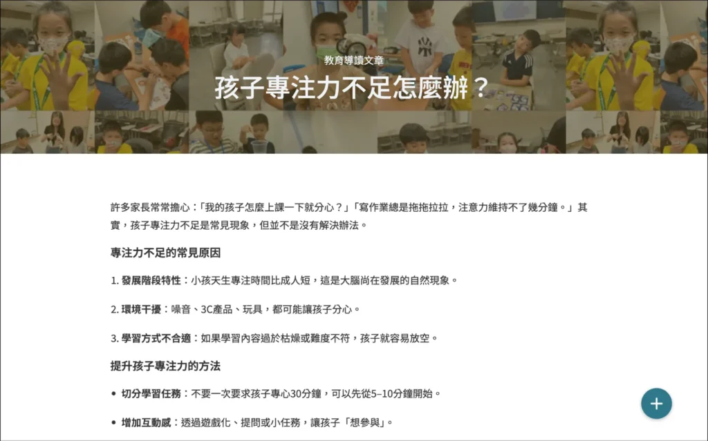
— Scalable Content: Established a “Knowledge Hub” (Blog) framework to build organic authority over time.

— Conversion Optimization: A modular inquiry form that makes it quick and easy for parents to reach out.

Authority Engine Framework: A professional content hub engineered to provide value-driven insights and reinforce institutional trust.
Conversion Protocol Optimization: A modular inquiry interface engineered for low-friction lead acquisition and high-stakes user engagement.

More Work

Three service types and projects.

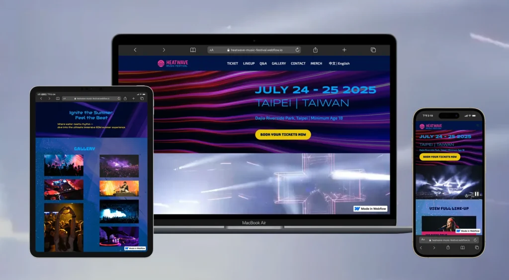
Translating event energy into a high-contrast, high-impact visual system.

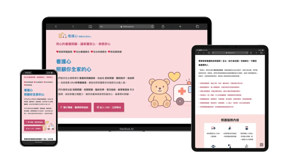
Turning scattered social posts into a high-trust official home for long-term care.

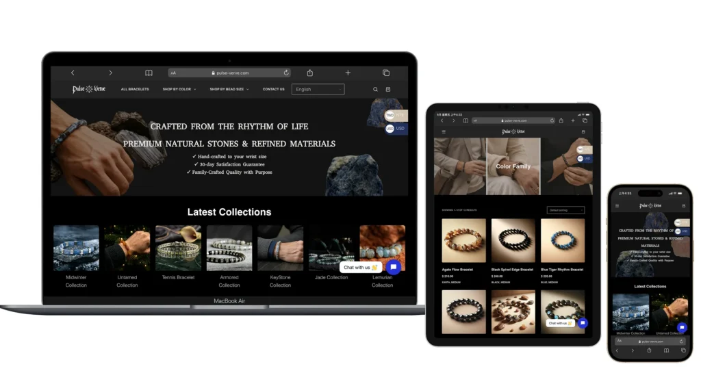
Reorganizing a cluttered product catalog into a clear, quietly luxurious storefront.

Build a Digital Presence Worthy of Your Work

If you also have a brand or a website that’s never quite been organized, let’s talk.