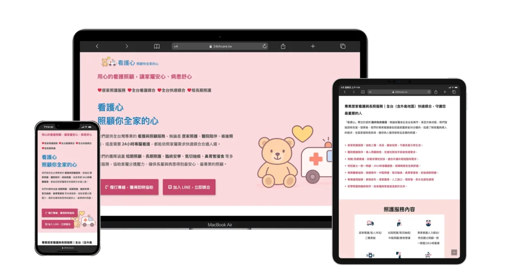
A comprehensive digital reconstruction of a long-term care service platform, transitioning from informal social-media-based communication to a high-trust, professional official presence focused on information accessibility and operational efficiency.
“Heartcare” (看護心) is a specialized healthcare matchmaking service for long-term elderly care. Previously operating without a central digital hub, the brand relied on scattered social media posts, leading to high communication overhead and a lack of perceived institutional authority.
The Situation
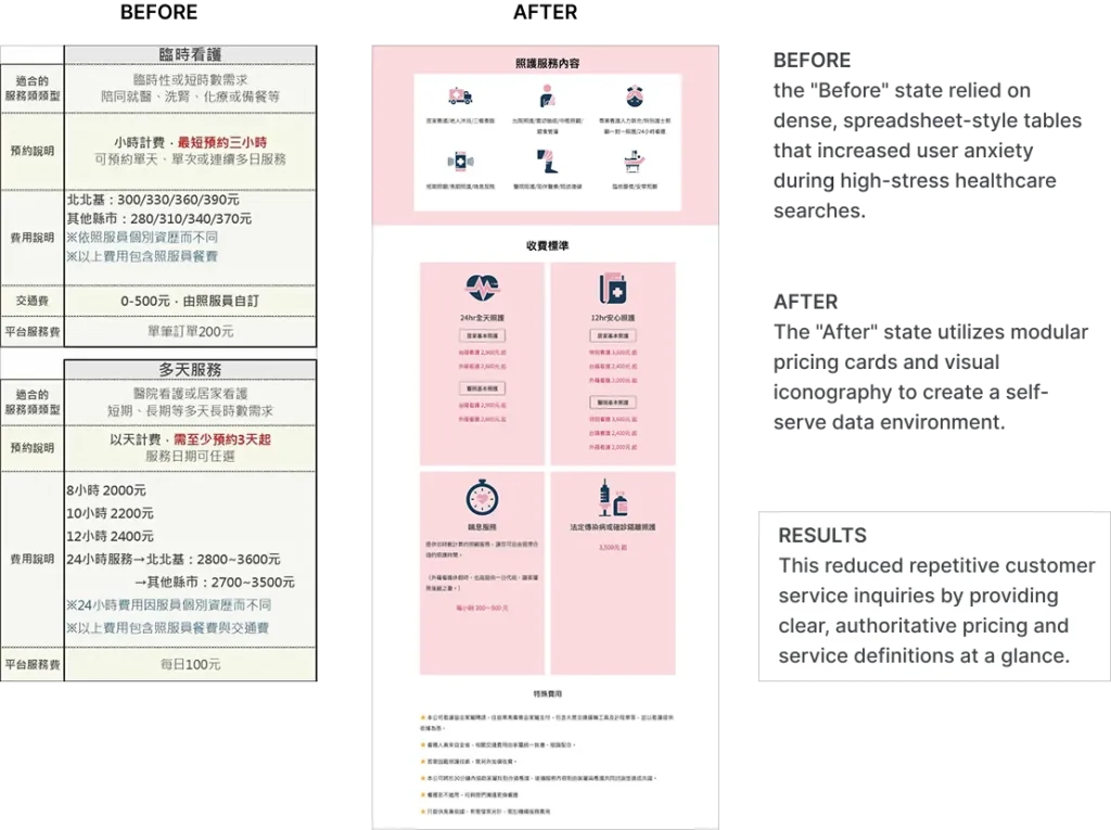
The brand suffered from “Information Fragmentation.” Potential clients — often stressed family members or senior stakeholders — had to manually hunt for pricing, service types, and procedures through chat logs. The tone was too casual for a healthcare environment, failing to project the level of safety and reliability required for high-stakes medical support.
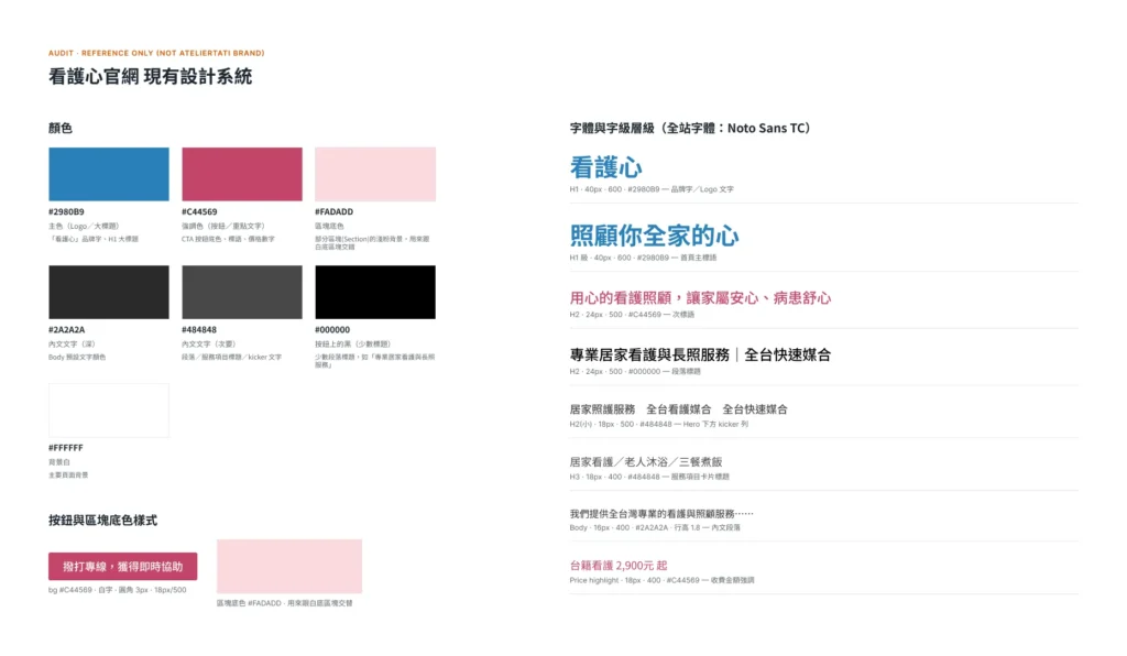
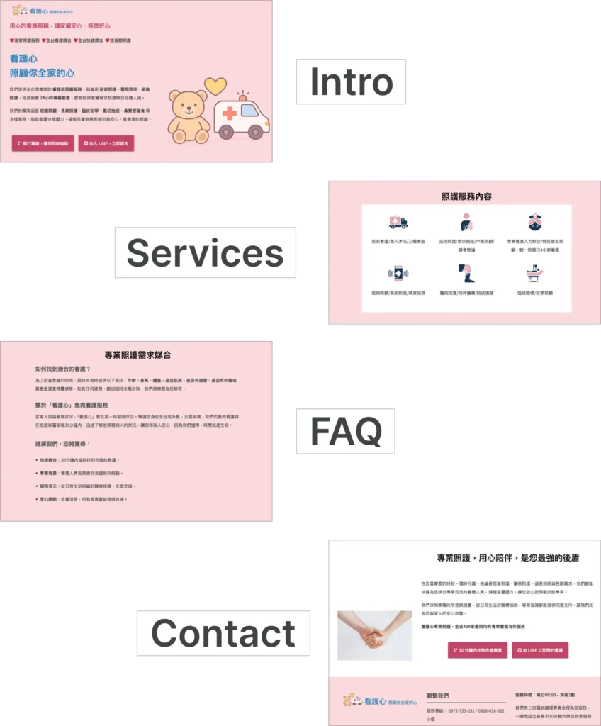
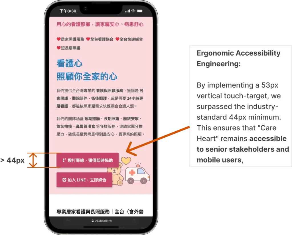
We performed a structural “Clean-Up” of the entire brand ecosystem. We audited the existing colloquial content and re-wrote it into a professional, “Safety-First” narrative. We abandoned the “Messy Feed” model and built a single-page high-conversion architecture. To ensure accessibility, we engineered a UI with large-format typography and high-contrast touch zones, ensuring the site was usable for both the digital-native child and the senior parent.
Technical Specifications
— Information Architecture: Systematic categorization of fragmented service data into modular blocks.
— Professional Copy Audit: Transformation of colloquial brand voice into high-precision, authoritative technical prose.
— Accessibility Engineering: UI optimization for high-readability, catering to senior stakeholders and mobile-first users.
— Conversion Mapping: Strategic integration of direct-response protocols (LINE/Tel) at high-intent decision nodes.
Services, Features & Business Results
Services Utilized
Technical Features
Business Results
UX Architecture
Multi-Segment Service Modularization
Reduced Inquiry Friction
Copy Engineering
Professional Tone Re-Calibration
Established Institutional Trust
Accessibility Design
Senior-Optimized Typography & Touch-Targets
Broadened User Demographic
Backend Deployment
Structured WordPress Foundation
Lowered Internal Lead-Gen Costs
The Results
— Institutional Authority: The visual and verbal shift from “Casual” to “Professional” immediately validated the brand’s premium market position.
— Operational Optimization: Clear service modules and FAQ structures reduced repetitive customer service inquiries by providing “Self-Serve” information.
— Technical Resilience: Successfully managed domain migration and cache-conflict resolution, delivering a high-performance, RWD-compliant digital foundation.