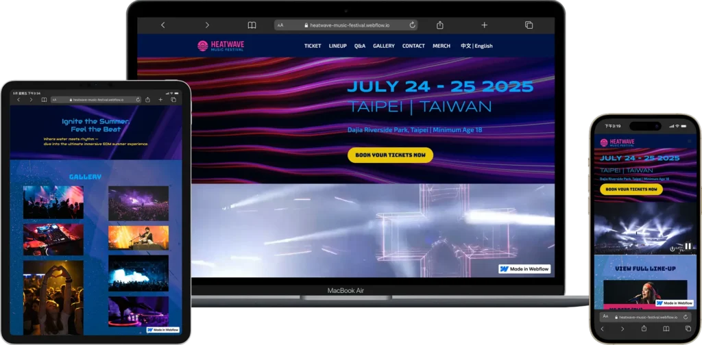
Turning the atmosphere of a live music festival into a website design — using bold color contrast and confident typography so people can feel the energy of a summer festival at a glance.
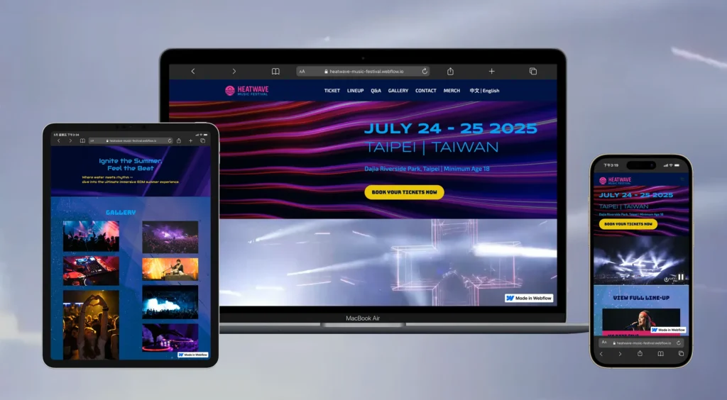
Heatwave is a concept project for a summer electronic music festival. The idea was to use color psychology — through the site’s color choices — to make people feel the same lively, exciting mood as being at the festival itself, just by looking at the website.
The Situation
Most festival websites use the same formulaic layouts, and even though the events themselves are lively, the sites rarely capture that excitement. This was a personal project, so the goal was simple: make people feel the summer excitement of the festival through the website alone, before they even buy a ticket.
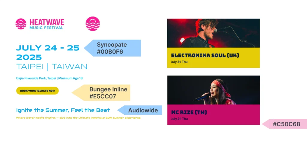
We chose an orange-and-red color palette paired with a dedicated typeface, giving the whole site a lively, festival feel, with consistent colors and type throughout. Since most people browse event sites like this on their phones, we designed the layout with mobile screens as the priority, so the visuals stay strong and clear even on a small screen.
To make that happen, we didn’t rely on complex code — we relied on color and type. We chose an orange-and-red palette paired with bold, industrial-feeling type, and set consistent type rules across the whole site so every page matches in weight and color. The result feels warm and cohesive throughout, while still reading as professional and deliberate.
Technical Specifications
— Visual System Design: An orange-and-red color palette chosen to evoke summer and festival energy at a glance.
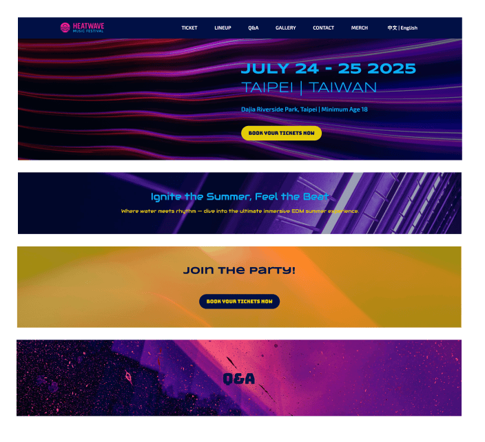
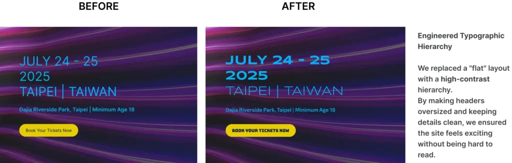
— Typographic Hierarchy: Bold, large headlines that stay legible even on a busy, image-heavy page.
— Layout Design: Built mobile-first, with more room for photos and images, and content that adapts to any screen size.
— Platform Choice: Built in Webflow, so the design translates directly into the live site — no separate developer handoff needed.
Services, Features & Business Results
Services Utilized
Technical Features
Business Results
UI Design
“Solar” Gradient & Contrast Management
High Brand Recognition
Visual Hierarchy
Bold Typographic Scale & Positioning
Enhanced Scannability
Mobile Optimization
Responsive Touch-Point Alignment
Improved On-the-Go UX
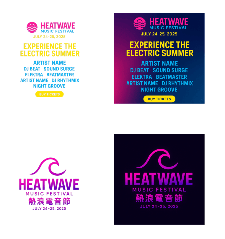
Brand Translation
Emotional Color Theory Implementation
Consistent Aesthetic Identity
The Results
— Color Confidence: Used a bold orange-and-red palette without the page turning cluttered or messy.
— Platform Execution: Turned the design into a fully working site in Webflow, with no separate development step needed.
— Consistent Design System: Every button and heading follows the same color and type rules, so the whole site reads as one coherent design.